Wave Accessibility Check

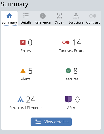
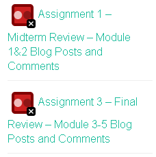
Running the Wave Accessibility Check on my Module 1 blog post revealed mostly Contrast Errors – looking further, it was apparent that changing the font color for some of the sidebar links would have improved visual accessibility.
This wasn’t a huge surprise to me – this was one of the default site template settings that I hadn’t changed, and it’s clear at first glance that the color choices could be more optimal. Moving forward, I’ll plan to change these colors to be more visually accessible.

Infographic
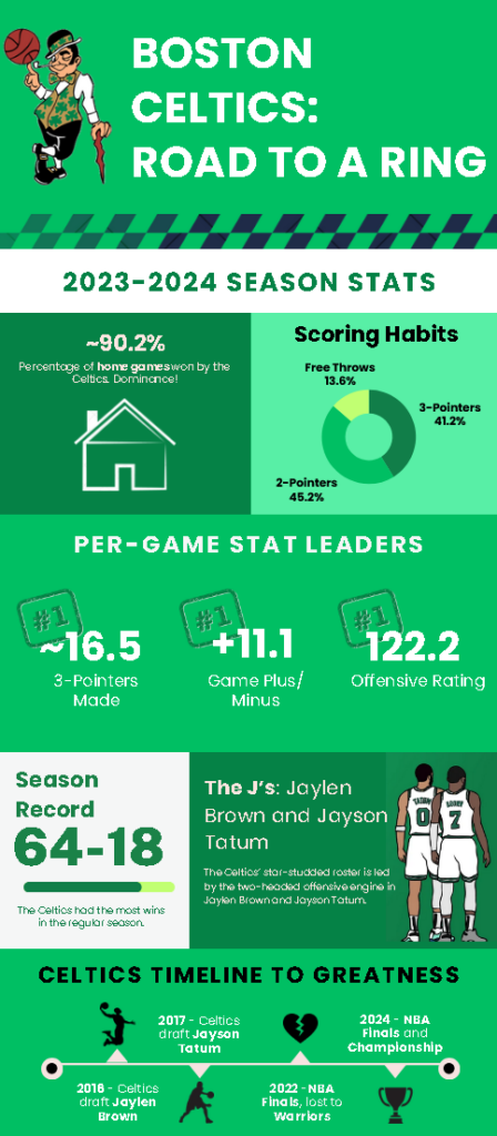
I decided to use Canva to create an infographic based on an NBA team called the Boston Celtics, which was a team that won last season’s NBA Championship. I attempted to apply as many relevant design principles as possible – notably, I made an effort in using proper alignment between different sections, as well as using contrast in different areas to highlight statistics and key points.
I also attempted to use repetition and negative space – specifically, I tried to keep the infographic colours consistent and thematic. The team colours of the Boston Celtics are green and black, so I utilized black, white, and different shades of green in different areas.

Overall, I really enjoyed this module and the challenge of creating an infographic that adheres to good visual design principles. I referenced an existing infographic design when creating mine, which I believe has benefits and drawbacks. The obvious benefit is having a starting point as to the layout and structure of the content. However, not all templates necessarily follow good design principles, and restricting yourself to a certain template might limit your overall design unless you’re comfortable with making adjustments along the way.
Hello Kevin,
Great work on this module! I like how you used the WAVE check to catch contrast issues and are planning to improve accessibility. It shows a lot of attention to detail. Your infographic on the Celtics looks really clean and organized—the consistent use of green, black, and white really makes it visually appealing and connects well with the theme. I like your reflection on using templates; it’s so true that they can be both helpful and limiting. Overall, it sounds like you put a lot of thought into both accessibility and design principles. Nice job!
Hi Kevin, thanks for sharing infographic with us. I appreciate how you acknowledged both the benefits and challenges of referencing an existing design, especially the importance of being mindful about adapting templates to ensure they align with good design principles. Your approach demonstrates a strong understanding of visual design and the willingness to refine your work, which is a crucial part of the creative process. Great job!