This module was a lot of fun! Playing around with branched storytelling and video creation was challenging, but was very creatively stimulating. I enjoyed learning about the different techniques for video creation, such as the use of active learning and visual elements for emphasis.
Branched Story – Twine
Creating a (short) branched story on Twine was a lot of fun. It was interesting to use the site, which had a lot of built-in features for simplicity (such as HTML rendering support). This type of interactive, non-linear story was reminiscent of certain online, role-playing video games I used to play a long time ago. It really aims to challenge the creator creatively – while there are technically a finite number of paths the player can go down, there are plenty of ways to maintain engagement.
One such idea I can think of is the notion of having ‘main areas’ and ‘sub areas’. Main areas could act as the familiar zone or main branching point where the player often returns to. This could create a sense of continuity and discovery as new areas or paths are unlocked and reachable from this area. On the other hand, allowing for discovery down new, branching paths keeps the player engaged (and there can be as many branches as the creator wants to add!).
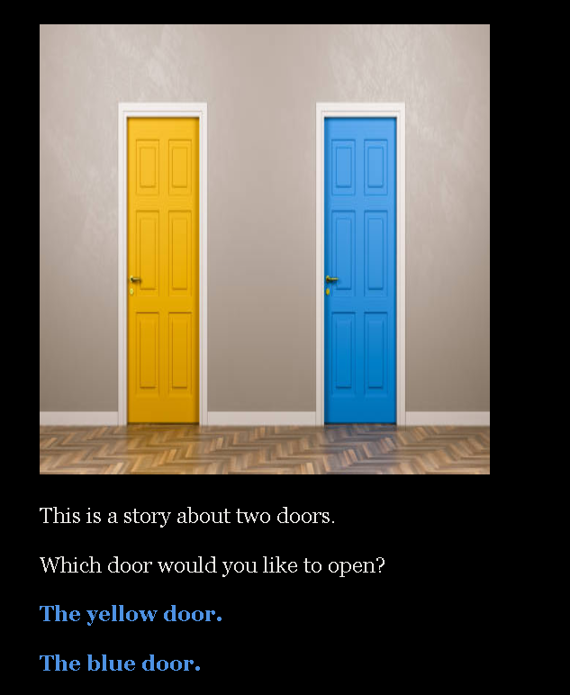
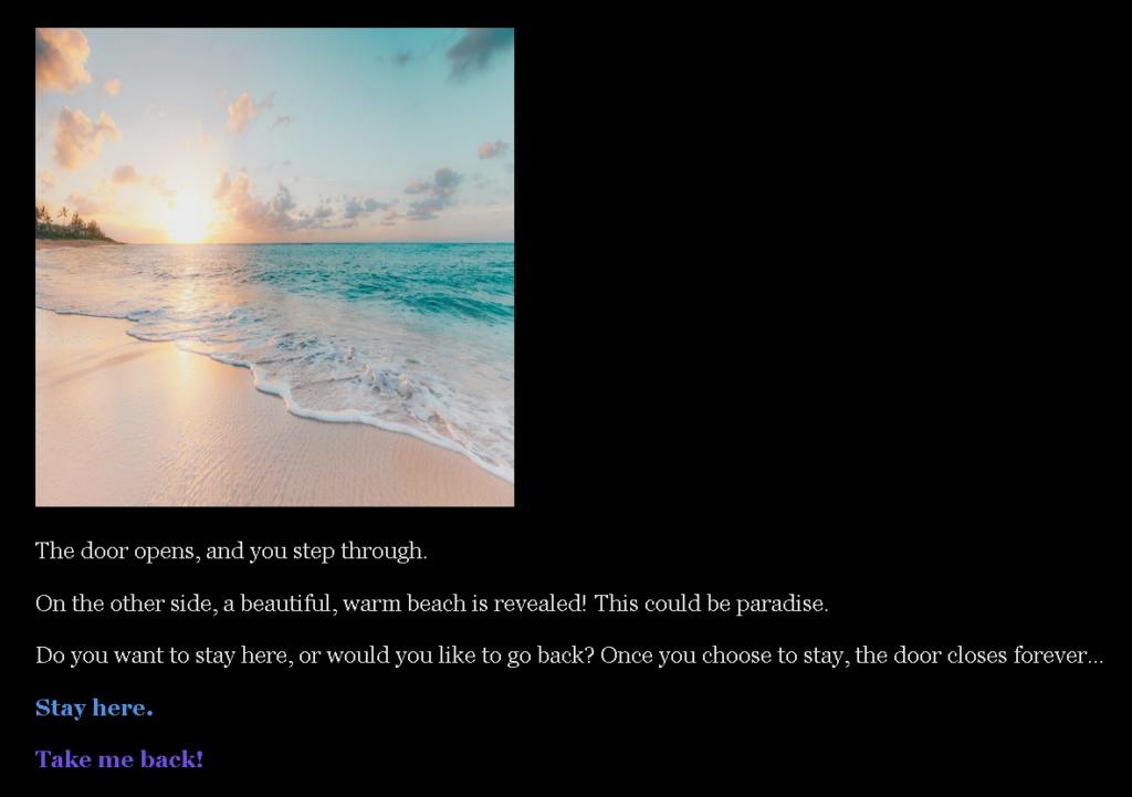
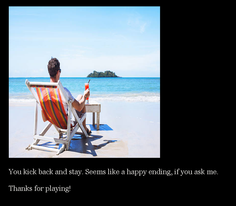
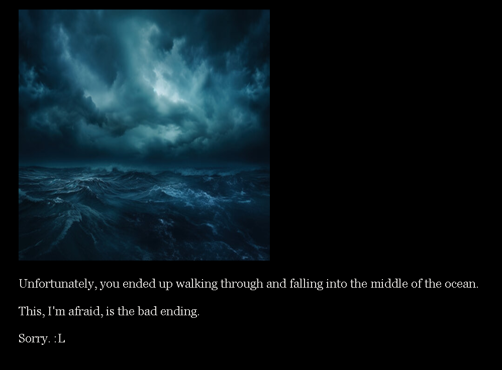
For the purposes of this module, I made a very simple game which meant to test this concept. There were two initial options: the yellow door, or the blue door. Choosing the yellow door presented a new area, but also gave the option to ‘return’ to the starting point. This allowed for more flexibility (if properly fleshed out) and non-linearity.
Video Creation – Pizza Tutorial
One of the challenges I found when creating the video was finding a good balance in terms of video length – it was difficult for me to keep the video short, given the assumption that viewers / learners would need some time to visually digest the information.
I took a different approach with the video, choosing to re-create a common style of cooking video that is popular on platforms such as YouTube.
For the purposes of engagement, I chose not to narrate the instructions. Rather, I decided to use simple subtitles / captions and an upbeat background music selection (royalty free) similar to other cooking videos.
I also attempted to use text and visual aids together where possible, in order to maintain consistency and accessibility.

Recent Comments